Carnegie Arts Center
clean • futuristic • bold
Overview
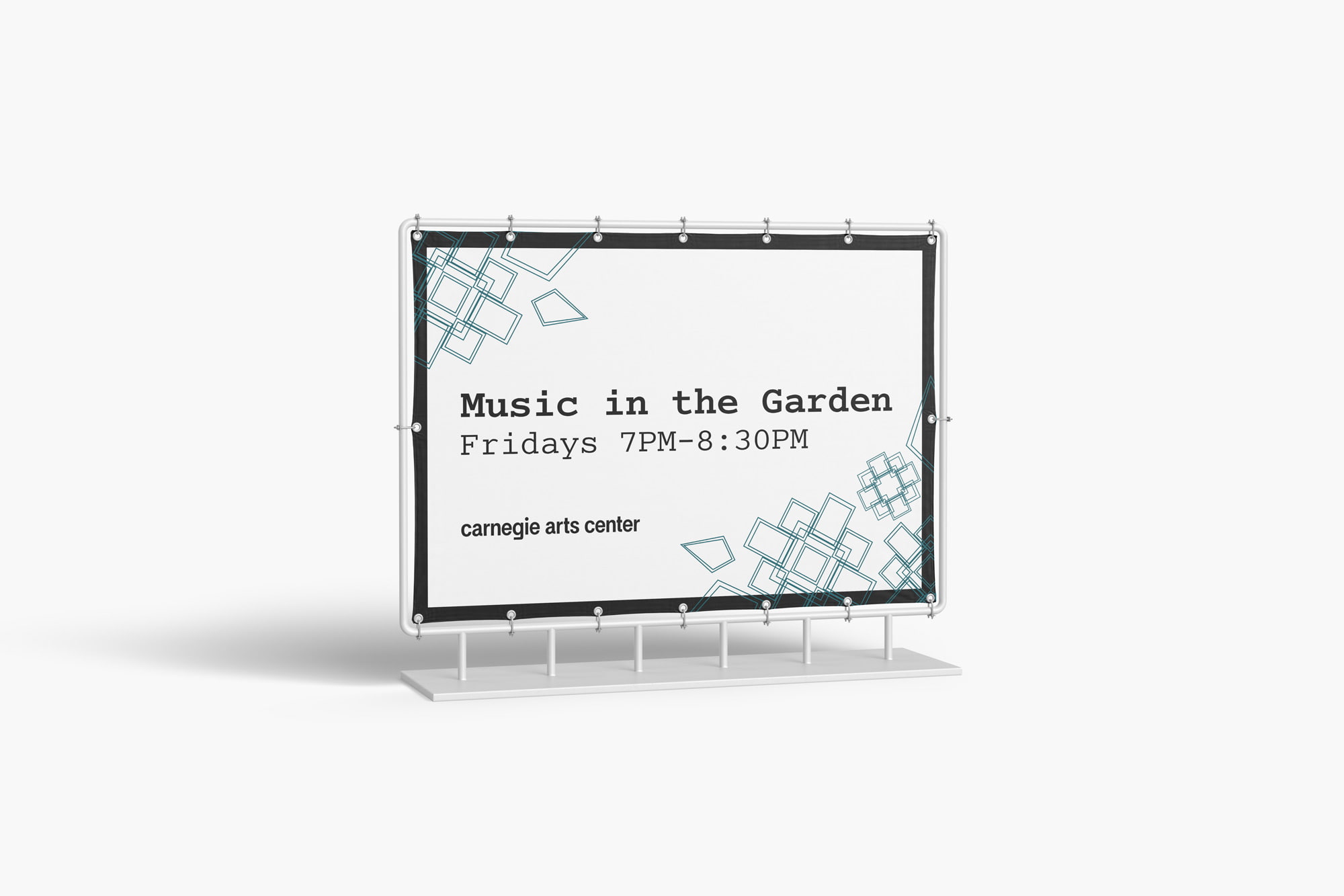
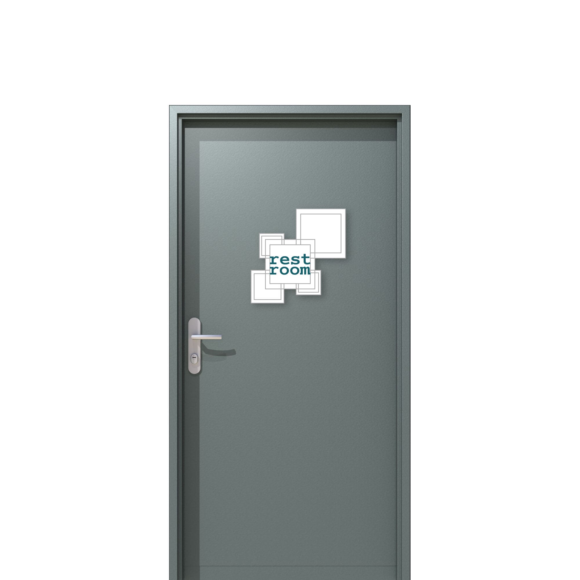
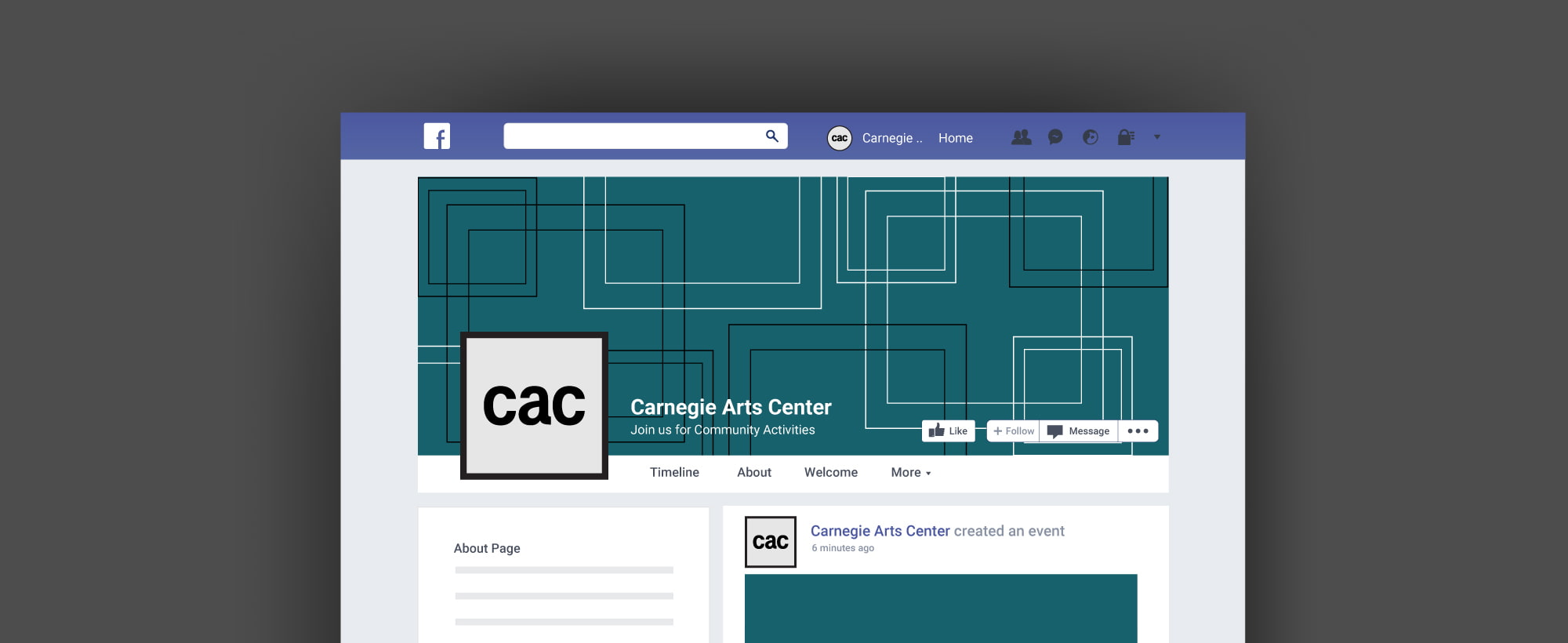
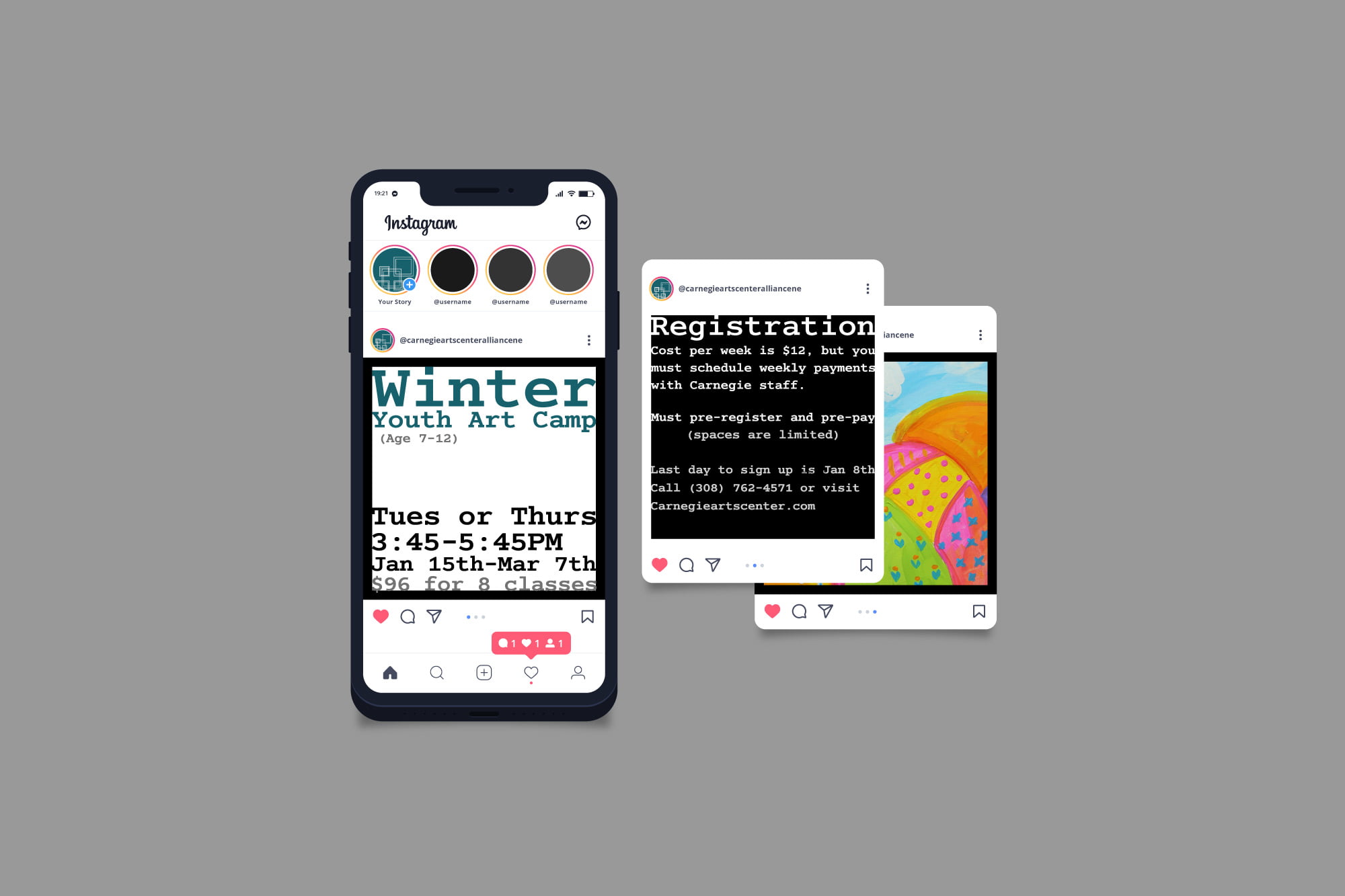
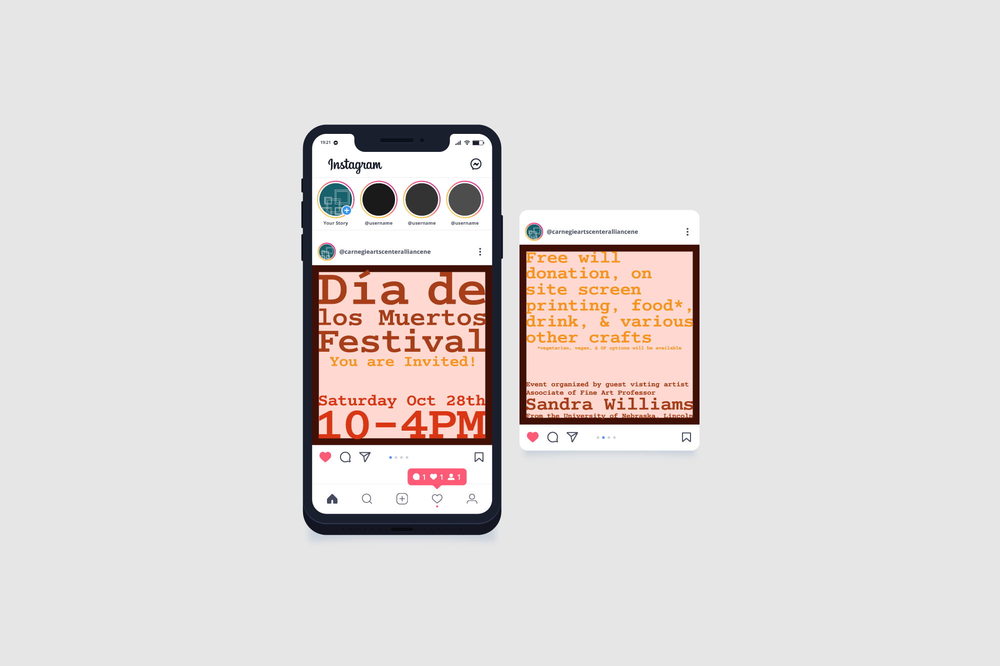
Carnegie Arts Center is a gallery and studio space for the Alliance, Nebraska, community. They had not updated their brand in many, many years and wanted a rebrand that would be good for years to come. Their focus is the art they house, so they wanted something simplistic that would not interfere with their works online or in person. They favored a design that had a “frame” motif throughout it. With this rebrand, they hoped to catch the eye of the youth in their community.
Process
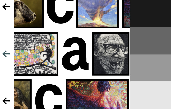
I started their rebrand with the logo and then went on to the website because it needed the most help with its endless links and unnecessary pages. I chose a wordmark because how could you pick just one symbol for a gallery that houses many different ideas and movements? The wordmark is lowercase to show that they are not the important part but rather the art. I designed the website to have an untraditional navigation that would catch anyone’s eye, specifically the youth, and maybe inspire them to step out of the box. The frame motif can be easily applied to anything without great interference. Their minimalistic design doesn’t get in the way and furthers their value of “doing it for the art.”
